Oil Painting ->Color
Color or colour is the perception of the frequency (or wavelength) of light, just as pitch (or a musical note) is the perception of the frequency (or wavelength) of sound.
It is a perception which in humans derives from the ability of the fine structure of the eye to distinguish (usually three) differently filtered analyses of a view. The perception of color is influenced by biology (some people are born seeing colors differently or not at all), long-term history of the observer, and also by short-term effects such as the colors nearby.
The science of color is sometimes called chromatics. It includes the perception of color by the human eye, the origin of color in materials, color theory in art, and the physics of color in the electromagnetic spectrum.
The colors of the visible light spectrum.
color wavelength interval frequency interval
red ~ 625-740 nm ~ 480-405 THz
orange ~ 590-625 nm ~ 510-480 THz
yellow ~ 565-590 nm ~ 530-510 THz
green ~ 500-565 nm ~ 600-530 THz
cyan ~ 485-500 nm ~ 620-600 THz
blue ~ 440-485 nm ~ 680-620 THz
violet ~ 380-440 nm ~ 790-680 THz

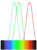
Continuous optical spectrum
Designed for monitors with gamma 1.5.
Computer "spectrum"
The bars below show the relative intensities of
the three
colors mixed to make the color immediately above.
Color, frequency, and energy of light.
Color /nm /1014 Hz /104 cm-1 /eV /kJ mol-1
Infrared >1000 <3.00 <1.00 <1.24 <120
Red 700 4.28 1.43 1.77 171
Orange 620 4.84 1.61 2.00 193
Yellow 580 5.17 1.72 2.14 206
Green 530 5.66 1.89 2.34 226
Blue 470 6.38 2.13 2.64 254
Violet 420 7.14 2.38 2.95 285
Near ultraviolet 300 10.0 3.33 4.15 400
Far ultraviolet <200 >15.0 >5.00 >6.20 >598
Electromagnetic radiation is a mixture of radiation of different
wavelengths and intensities. When this radiation has a wavelength
inside the human visibility range (approximately from 380 nm to
740 nm), it is called light. The light's spectrum records each wavelength's
intensity. The full spectrum of the incoming radiation from an object
determines the visual appearance of that object, including its perceived
color. As we will see, there are many more spectra than color sensations;
in fact one may formally define a color to be the whole class of
spectra which give rise to the same color sensation, although any
such definition would vary widely among different species and also
somewhat among individuals intraspecifically.
A surface that diffusely reflects all wavelengths equally is perceived as white, while a dull black surface absorbs all wavelengths and does not reflect (for mirror reflection this is different: a proper mirror also reflects all wavelengths equally, but is not perceived as white, while shiny black objects do reflect).
The familiar colors of the rainbow in the spectrum—named from the Latin word for appearance or apparition by Isaac Newton in 1671—contains all those colors that consist of visible light of a single wavelength only, the pure spectral or monochromatic colors.
The frequencies are approximations and given in terahertz (THz). The wavelengths, valid in vacuum, are given in nanometers (nm). A list of other objects of similar size is available.
The color table should not be interpreted as a definite list—the pure spectral colors form a continuous spectrum, and how it is divided into distinct colors is a matter of taste and culture.
Similarly, the intensity of a spectral color may alter its perception considerably; for example, a low-intensity orange-yellow is brown, and a low-intensity yellow-green is olive-green.
Most light sources are not pure spectral sources; rather they are created from mixtures of various wavelengths and intensities of light. To the human eye, however, there is a wide class of mixed-spectrum light that is perceived the same as a pure spectral color. In the table above, for instance, when your computer screen is displaying the "orange" patch, it is not emitting pure light at a fixed wavelength of around 600 nm (which is in fact not a thing most computer screens are even able to do). Rather, it is emitting a mixture of about two parts red to one part green light. Were you to print this page on a color printer, the orange patch on the paper, when lit with white light, would reflect yet another, more continuous spectrum. We cannot see those differences (although many animals can), and the reason has to do with the pigments that make up our color vision cells (see below).
A useful quantification of this property is the dominant wavelength, which matches a wavelength of spectral light to a non-spectral source that evokes the same color perception. Dominant wavelength is the formal background for the popular concept of hue.

In addition to the many light sources that can appear to be pure spectral colors but are actually mixtures, there are many color perceptions that by definition cannot be pure spectral colors due to desaturation or because they are purples (which do not appear in the Newtonian pure spectrum). Some examples of necessarily non-spectral colors are the achromatic colors (black, gray and white) and other colors such as pink, tan and magenta. See metamerism (color) for a basic intro to why color matching challenges exist.
The wave equation describes the behavior of light and so we should be able to describe color spectra in terms of the mathematical properties of the solutions of the wave equation. However, to understand which particular color perception will arise from a particular physical spectrum requires knowledge of the specific retinal physiology of the observer. For completeness, we include a simple equation for light traveling in a vacuum:
utt=c2(uxx+uyy+uzz)
where the subscripts denote partial derivatives and c is the speed
of light. If we fix (x,y,z) a point in space and look at the solution
u(x,y,z,t) as a function of t, we obtain a signal. If we take the
Fourier transform of this signal, we obtain a frequency decomposition
as described above. Each frequency has an amplitude and phase. The
frequency multiplied by Planck's constant h determines the energy
of a photon of the relevant component. The square of the amplitude
represents the intensity, which is the amount of energy transmitted
per second through a unit area of a surface perpendicular to the
light propagation. The phase information is much more mysterious
because it is difficult to measure and observe. Humans cannot perceive
phase effects of light except in special cases of interference (e.g.
see thin-film optics) where phase effects lead to perceptible amplitude
changes. Most light has randomly distributed phases, but lasers
are more efficient when the photons all have the same phase.
Though the exact status of color is a matter of current philosophical dispute, color is arguably a psychophysical phenomenon that exists only in our minds. (See Qualia, for some of that dispute.) A "red" apple does not give off "red light", and it is misleading to think of things that we see, or of light itself, as objectively colored at all. Rather, the apple simply absorbs light of various wavelengths shining on it to different degrees, in such a way that the unabsorbed light which it reflects is perceived as red. An apple is perceived to be red only because normal human color vision perceives light with different mixes of wavelengths differently—and we have language to describe that difference.
In 1931, an international group of experts called the Commission Internationale d'Eclairage (CIE) developed a mathematical color model. The premise used by the CIE is that color is the combination of three things: a light source, an object, and an observer. The CIE tightly controlled each of these variables in an experiment that produced the measurements for the system.
Although Aristotle and other ancient scientists speculated on the nature of light and color vision, it was not until Newton that light was correctly identified as the source of the color sensation. Goethe studied the theory of colors, and in 1801 Thomas Young proposed his trichromatic theory which was later refined by Hermann von Helmholtz. That theory was confirmed in the 1960s and will be described below.
Normalized typical human cone responses (and the rod response) to monochromatic spectral stimuliThe retina of the human eye contains three different types of color receptor cells, or cones. One type, relatively distinct from the other two, is most responsive to light that we perceive as violet, with wavelengths around 420 nm (cones of this type are sometimes called short-wavelength cones, S cones, or, most commonly but quite misleadingly, blue cones). The other two types are closely related genetically, and in chemistry and response, and each type is most responsive to light that we perceive as green or greenish. One of these types (sometimes called long-wavelength cones, L cones, or, misleadingly, red cones) is most sensitive to light we perceive as yellowish-green, with wavelengths around 564 nm; the other type (sometimes called middle-wavelength cones, M cones, or green cones) is most sensitive to light perceived as green, with wavelengths around 534 nm. The term "red cones" for the long-wavelength cones is deprecated as this type is actually maximally responsive to light we perceive as greenish, albeit longer wavelength light than that which maximally excites the mid-wavelength/"green" cones.
The sensitivity curves of the cones are roughly bell-shaped, and overlap considerably. The incoming signal spectrum is thus reduced by the eye to three values, sometimes called tristimulus values, representing the intensity of the response of each of the cone types.
Because of the overlap between the sensitivity ranges, some combinations of responses in the three types of cone are impossible no matter what light stimulation is used. For example, it is not possible to stimulate only the mid-wavelength/"green" cones: the other cones must be stimulated to some degree at the same time, even if light of some single wavelength is used (including that to which the target cones are maximally sensitive). The set of all possible tristimulus values determines the human color space. It has been estimated that humans can distinguish roughly 10 million different colors, although the identification of a specific color is highly subjective, since even the two eyes of a single individual perceive colors slightly differently. This is discussed in more detail below.
The rod system (which vision in very low light relies on exclusively) does not by itself sense differences in wavelength; therefore it is not normally implicated in color vision. But experiments have conclusively shown that in certain marginal conditions a combination of rod stimulation and cone stimulation can result in color discriminations not based on the mechanisms described above.
While the mechanisms of color vision at the level of the cones in the retina are well described in terms of tristimulus values (see above), color processing and perception above that base level are organized differently. A dominant theory of the higher neural mechanisms of color vision proposes three opponent processes, or opponent channels, constructed out of the raw input from the cones: a red-green channel, a blue-yellow channel, and a black-white ("luminance") channel. This theory does something to account for the structure of our subjective color experience (see discussion below). Blue and yellow are considered complementary colors, or opposites: you could not experience a bluish yellow (or a greenish red), any more than you could experience a dark brightness or a hot coldness. The four "polar" colors proposed as extremes in the two opponent processes other than black-white have some natural claim to being called primary colors. This is in competition with various sets of three primary colors proposed as "generators" of all normal human color experience (see below).
If one or more types of a person's color-sensing cones are missing or less responsive than normal to incoming light, that person has a smaller or skewed color space and is said to be color deficient. Another term frequently used is color blind, although this can be misleading; only a small fraction of color deficient individuals actually see completely in black and white, and most simply have anomalous color perception. Some kinds of color deficiency are caused by anomalies in the number or nature of cones of the various types, as just described. Others (like central or cortical achromatopsia) are caused by neural anomalies in those parts of the brain where visual processing takes place.
Some animals may have more than three different types of color receptor (most marsupials, birds, reptiles, and fish; see tetrachromat, below) or fewer (most mammals; these are called dichromats and monochromats).
An unusual and elusive neurological condition sometimes affecting color perception is synaesthesia.
A normal human is a trichromat (from Greek: tri=three, chroma=color). In theory it may be possible for a person to have four, rather than three, distinct types of cone cell. If these four types are sufficiently distinct in spectral sensitivity and the neural processing of the input from the four types is developed, a person may be a tetrachromat (tetra=four). Such a person might have an extra and slightly different copy of either the medium- or long-wave cones. It is not clear that such people exist or that the human brain could actually process the information from such an extra cone type separately from the standard three. However, strong evidence suggests such people do exist, are all female by genetic imperative, and their brain gladly adapts to use the additional information. For many species, tetrachromacy is the normal case, although the cone cells of animal tetrachromats have a very different (more evenly-spaced) spectral sensitivity distribution than those of possible human tetrachromats.
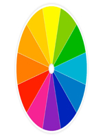
There is an interesting phenomenon which occurs when an artist uses a limited color palette: the eye tends to compensate by seeing any grey or neutral color as the color which is missing from the color wheel. E.g.: in a limited palette consisting of red, yellow, black, and white, a mixture of yellow and black will appear as a variety of green, a mixture of red and black will appear as a variety of purple, and pure grey will appear bluish.
When the eye shifts attention after viewing a color for some time, then an after-image of the complement of that color (the color opposite to it in the color wheel) is perceived by the eye for some time wherever it moves. This effect of color perception was utilised by Vincent van Gogh, a Post-Impressionist painter.
Note that the color experience of a given light mixture may vary with absolute luminosity, because both rods and cones are active at once in the eye, with each having different color curves, and rods taking over gradually from cones as the brightness of the scene is reduced. This effect leads to a change in color rendition with absolute illumination levels that can be summarised in the "Kruithof curve".
Different cultures have different terms for colors, and may also assign some color names to slightly different parts of the spectrum, or have a different color ontology: for instance, the Han character ? (pronounced qing in Mandarin and aoi in Japanese) has a meaning that covers both blue and green;
Similarly, languages are selective when deciding which hues are split into different colors on the basis of how light or dark they are. Apart from the black-grey-white continuum, English splits some hues into several distinct colors according to lightness: such as red and pink or orange and brown. To English speakers, these pairs of colors, which are objectively no more different that light green and dark green, are conceived as totally different. An Italian will make the same red-pink and orange-brown distinctions, but will also make a further distinction between blu and azzurro, which English speakers would simply call dark and light blue. To Italian speakers, blu and azzurro are as separate as red and pink or orange and brown.
Color terms evolve. It is argued that there are a limited number of universal "basic color terms" which begin to be used by individual cultures in a relatively fixed order. For example, a culture would start with only two terms, meaning roughly 'dark' (covering black, dark colors and cold colors such as blue ) and 'bright' (covering white, light colors and warm colors such as red), before adding more specific color names, in the order of red; green and/or yellow; blue; brown; and orange, pink, purple, and/or gray. Older arguments for this theory also stipulated that the acquisition and use of basic color terms further along the evolutionary order indicated a more complex culture with more highly developed technology.
A somewhat dated example of a universal color categories theory is Basic Color Terms: Their Universality and Evolution (1969) by Brent Berlin and Paul Kay. A more recent example of a linguistic determinism theory might be Is color categorisation universal? New evidence from a stone-age culture (1999) by Jules Davidoff et al. The idea of linguistically determined color categories is often used as evidence for the Sapir-Whorf hypothesis (Language, Thought, and Reality (1956) by Benjamin Lee Whorf).
Additionally, different colors are often associated with different emotional states, values, or groups, but these associations can vary between cultures. In one system, red is considered to motivate action; orange and purple are related to spirituality; yellow cheers; green creates cosiness and warmth; blue relaxes; and white is associated with either purity or death. These associations are described more fully in the individual color pages, and under color psychology.
The trichromatric theory discussed above is strictly true only if the whole scene seen by the eye is of one and the same color, which of course is unrealistic. In reality, the brain compares the various colors in a scene, in order to eliminate the effects of the illumination. If a scene is illuminated with one light, and then with another, as long as the difference between the light sources stays within a reasonable range, the colors of the scene will nevertheless appear constant to us. This was discovered by Edwin Land in the 1970s and led to his retinex theory of color constancy.
Some of the beautiful colour paintings are below: